Jacob Gowans
  • Home
  • About Jacob Gowans
  • Blog
  • Get Notified!
  • Contact Jacob
  • Jacob's Reading List

Happy Halloween!

10/31/2013

9 Comments

 
First of all, thanks to everyone for your well-wishes and prayers for my wife and newborn son, Cal-L. Both of them are doing great. Last week was busy. My daughter lost her first tooth, we cared for a newborn premie, and I got my book deal from Shadow Mountain Publishing for A Tale of Light and Shadow, due out July 29, 2014. The details aren't ironed out yet, but I've submitted to them my requests for changes to the contract. We'll see what they say in return over the next week or two.

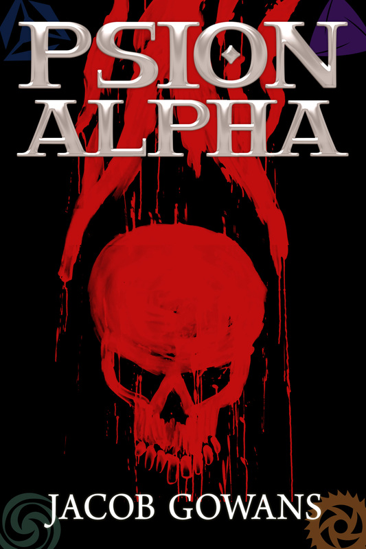
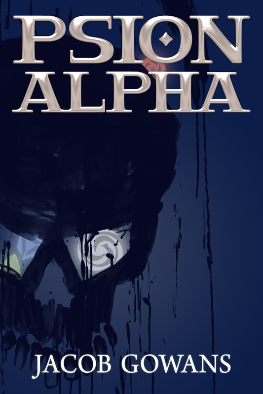
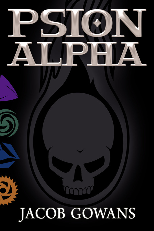
In the meantime, the process of publishing Psion Alpha moves forward. Today I'm going to post below three of the concept images that Britta and I are working on. These are based off of my thoughts and her sketches. Again, these aren't final products, but the next steps as we try to figure out the awesome final cover. Feel free to share your thoughts in the comments.
Picture
Picture
Picture
9 Comments
Karen Gowans
10/31/2013 08:33:54 am

I like the last one.

Reply
Leland link
10/31/2013 09:10:51 am

Me gusto #2.

Reply
Mark Steele
10/31/2013 10:54:59 am

I like the third one--strong but subtle color set.

Reply
John
10/31/2013 01:41:20 pm

I like the skull on the third cover. But I like the placement and more muted colors of the 4 psion symbols in the corners of the first cover. Combine them and it will be perfect IMHO.

Reply
Your Brother
10/31/2013 01:54:14 pm

I like the first one, though I would say make the Alpha symbol with a little cleaner lines and the other symbols more muted like the second cover.

Reply
Danielle @ Consuming Worlds link
10/31/2013 02:45:11 pm

My vote is for number 3. Clean, crisp and sharp!

Reply
Brittany
10/31/2013 08:40:23 pm

My gut reaction is that I like three. With my obsessiveness the clean lines appeal to me. But then I started thinking it's kind of cartoony/clip artsy because of the clean lines. So I decided I like two best. It leaves more details to be wanted which makes me think of suspense which makes me feel it fits the books' styles.

Reply
Sam
10/31/2013 11:25:49 pm

I like the hand drawn feel of the first two. The third is to clean, and I feel from the first 3 chapters you released the symbol does not have a clean history.

Reply
Mary Ellen Waltz link
11/20/2013 02:03:33 am

HI, I am a 53 year old Nana. My 15 year old grandson loves this series and comes home everyday and asks me if this book is out yet so we can download it. I would like to get him the hard copy for Christmas, and I just wanted to let you know, I would purchase the 3rd cover, but I would shy away from the other two.
If parents and grandparents are your customers, may I suggest the third cover. If you feel the person actually purchasing the book is of a lower age demographics, I would suggest the 2nd. In my opinion, the first cover is just VERY harsh. Thank you for asking for the comments. And thank you for getting my grandson interested in reading!

Reply


Leave a Reply.

    I am an Author.

    And a dentist. And a husband. And a daddy. And a movie lover. And opinionated.

    My Projects:

    1. Super Six:
    -First draft finished
    2. Tale 2: Secrets of Neverak
    -Published
    4. Tale 3
    -on hold

    Archives

    June 2022
    May 2019
    March 2016
    February 2016
    July 2015
    April 2015
    March 2015
    February 2015
    January 2015
    December 2014
    November 2014
    October 2014
    September 2014
    August 2014
    July 2014
    May 2014
    April 2014
    March 2014
    February 2014
    January 2014
    December 2013
    November 2013
    October 2013
    September 2013
    August 2013
    July 2013

    Categories

    All

    RSS Feed

Powered by Create your own unique website with customizable templates.